1) Add your finished magazine cover as a JPEG image.
2) Type up your feedback from your teacher. You don't need to include a mark or grade if you don't want to.
WWW: This is a very good cover – there is a lot to credit here. The image is extremely convincing for Elle – particularly in terms of mise-en-scene and image focus. The cover lines are well written and capture the Elle style impressively. I also like your evaluation which is pretty much spot on. The fact that you are reflecting on your work and holding yourself to such high standards is a very good sign for the real coursework next year
EBI: There are two factors that are keeping you out of the top level here. Firstly, the typography is very difficult to read – you needed a different font to fit the Elle house style. The three blocks of text are also compressed and make it slightly difficult to read so audiences they won’t take the full meaning of the cover such as the text ‘Mental Health’ has no space in between the words. In terms of hitting professional standards, we need to make sure everything is perfect. I have no doubt that this task was beneficial in you getting to grips with Photoshop and by the actual coursework you will be more confident with the software
Mark: 12/15
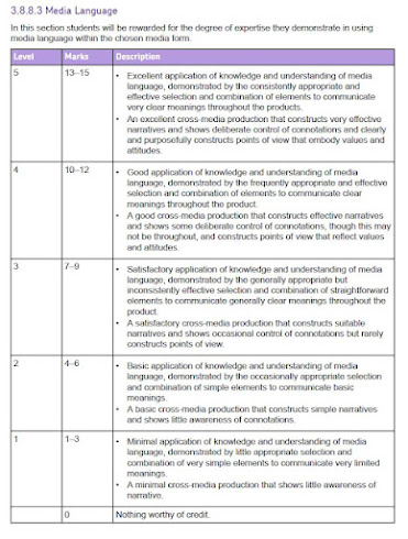
3) Consider your mark against the mark scheme. What are the strengths of your production based on the the mark scheme? Think about magazine cover conventions and the media language techniques you have used to communicate with your audience (e.g. mise-en-scene, camera shot etc.)
One strength of my magazine cover was that I upheld the Elle magazine convention of placing the model in front of the name of the magazine as well as the four-five cover lines which are typically about self-care about fashion. I have also strategically taken a picture of the model using a medium shot which is also another convention of Elle magazine in order to try replicate the Elle magazine cover to the best of my ability. I also tried to recreate the convention of a blank background as well as I could but struggled to make the lighting look natural
4) Look at the mark scheme again. What can you do to move your mark higher and, if required, move up a level?
In order to move my mark higher, I could have ensured that the text for the cover lines was clearer to read by making it a colour that does not blend in with the background and spacing out the letters better. I also could worked on the lighting in order to make the image on the cover look clearer because the lack of naturalism likely made my mark lower
5) What would be one piece of advice you would give a student about to start the same magazine cover project you have just completed?


No comments:
Post a Comment